
Brand Identity · Character Design · Food & Hospitality
Silly Goose
Sandwiches
A new food truck needed a face. It started with a simple request: a silly goose holding a sandwich. The challenge was figuring out exactly what kind of silly could become a memorable, usable brand.
The Brief
ONE GOOSE.
TONS OF PERSONALITY.
Silly Goose Sandwiches began with a name, a food-truck plan, and an intentionally loose visual idea. The owners knew they wanted a goose, a sandwich, and a sense of humor. Everything else was open.
The job was to turn that starting point into a character people could recognize at a glance—and an identity flexible enough to work on a truck, menu, packaging, merchandise, digital media, and whatever came next.
- Client
- Silly Goose Sandwiches
- Origin
- March 24, 2026
- Role
- Brand Identity Designer / Illustrator
- Contribution
- Brand positioning / Mascot design / Logo development / Color system / Typography / Application concepts / Production files
- Final Form
- Mascot-led visual identity system
- Status
- Identity completed and delivered prior to truck launch
Finding the Position
HOW SILLY IS SILLY?
Before deciding what the goose should look like, I looked at the visual territory it would have to occupy.
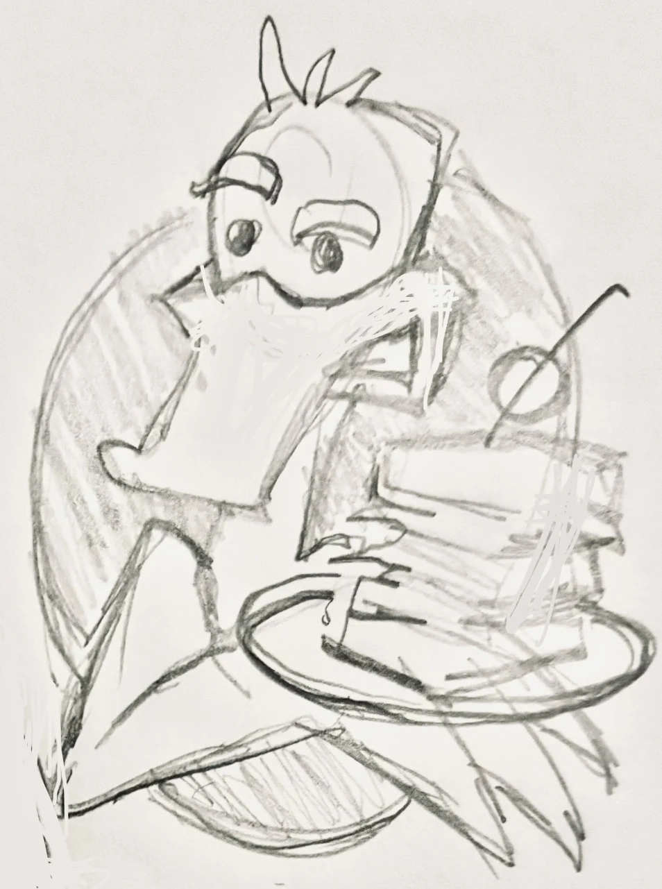
Food brands have used birds for decades, from polished corporate marks to full-blown cartoon mascots. I mapped recognizable examples against two qualities that mattered here: attitude and sophistication.
Too restrained and Silly Goose could disappear into generic food branding. Too manic and the character could become a joke that overwhelmed the food.
The opportunity was somewhere between them: playful, approachable, memorable, but still credible enough to represent a real business.
THE NAME ALREADY HAD PERSONALITY. THE TRICK WAS FINDING JUST THE RIGHT AMOUNT OF IT.
Character Exploration
BUILD A GAGGLE.
FIND THE GOOSE.
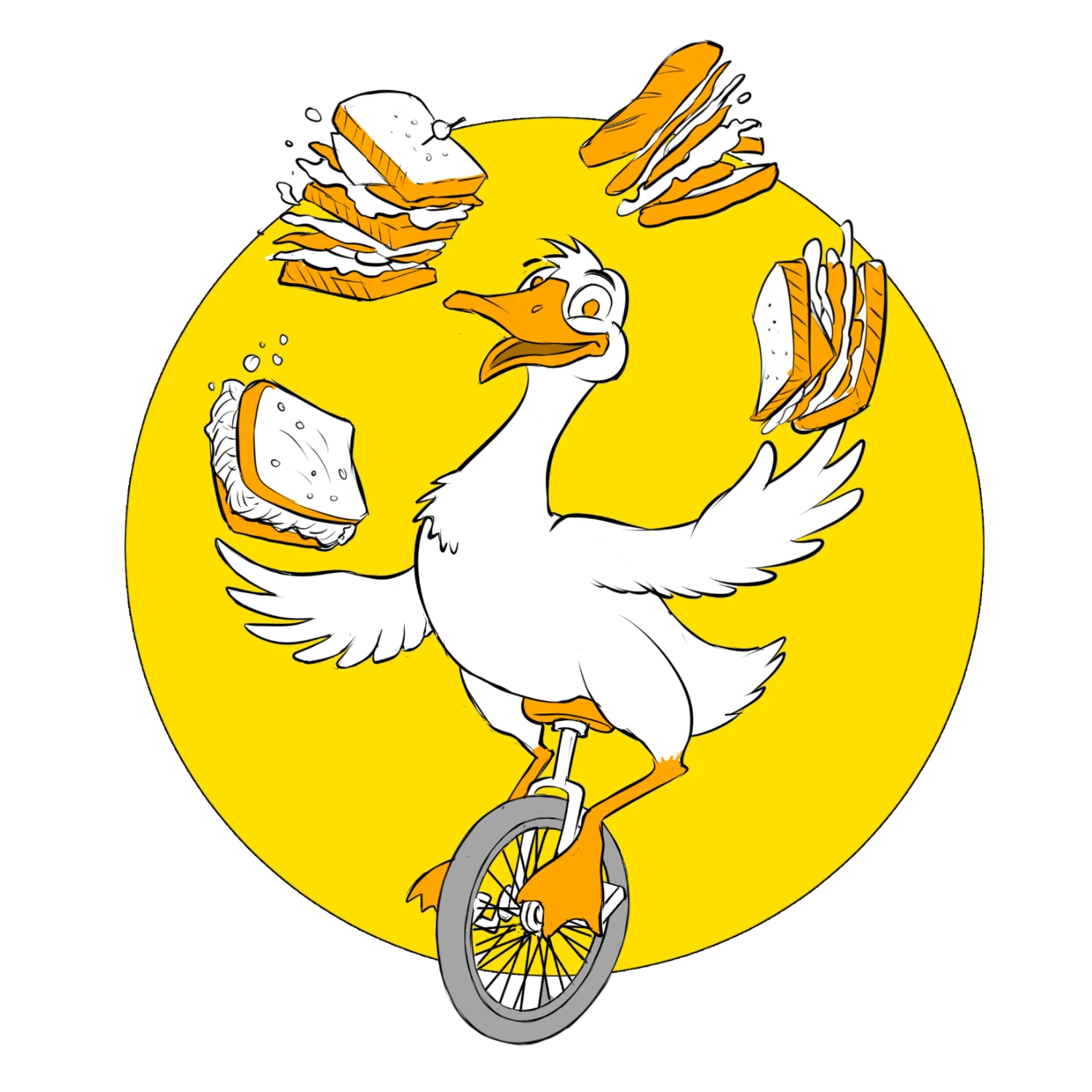
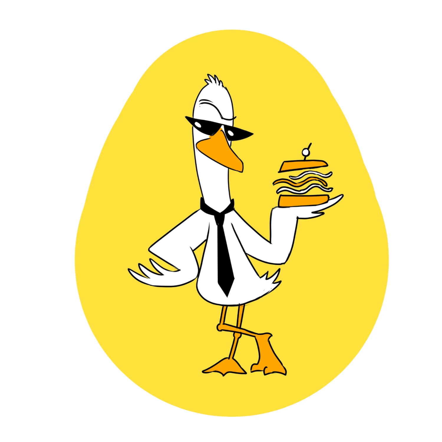
The first round explored different interpretations of the same brief rather than variations of a single drawing.
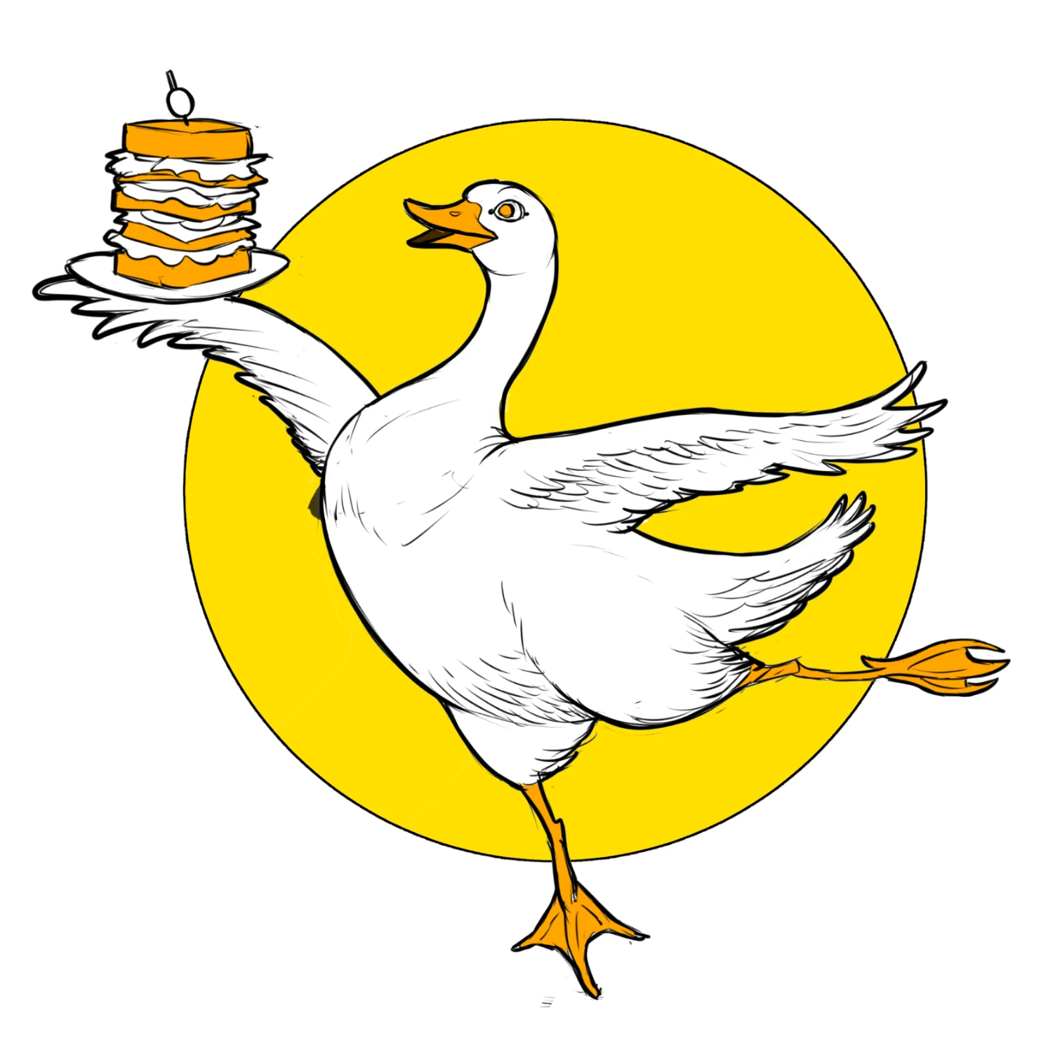
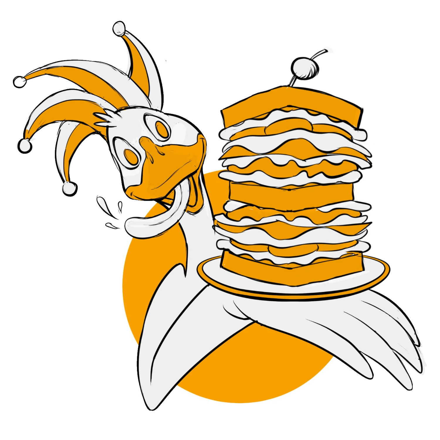
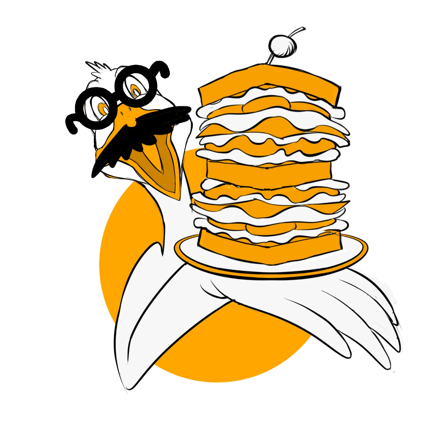
The Dancers combined an elegant goose silhouette with absurd situations and accessories. The Posers pushed attitude and irreverence. The Hucksters put the food front and center, turning the sandwich itself into part of the character performance.
That range gave the clients something more useful than a collection of stylistic options. They could decide what kind of personality they wanted the business to have.
The Turning Point
PUT THE SANDWICH
IN THE SPOTLIGHT.
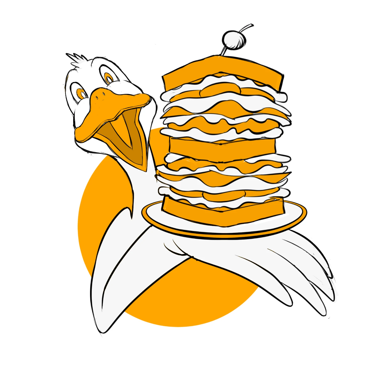
The strongest direction came from the food-focused group.
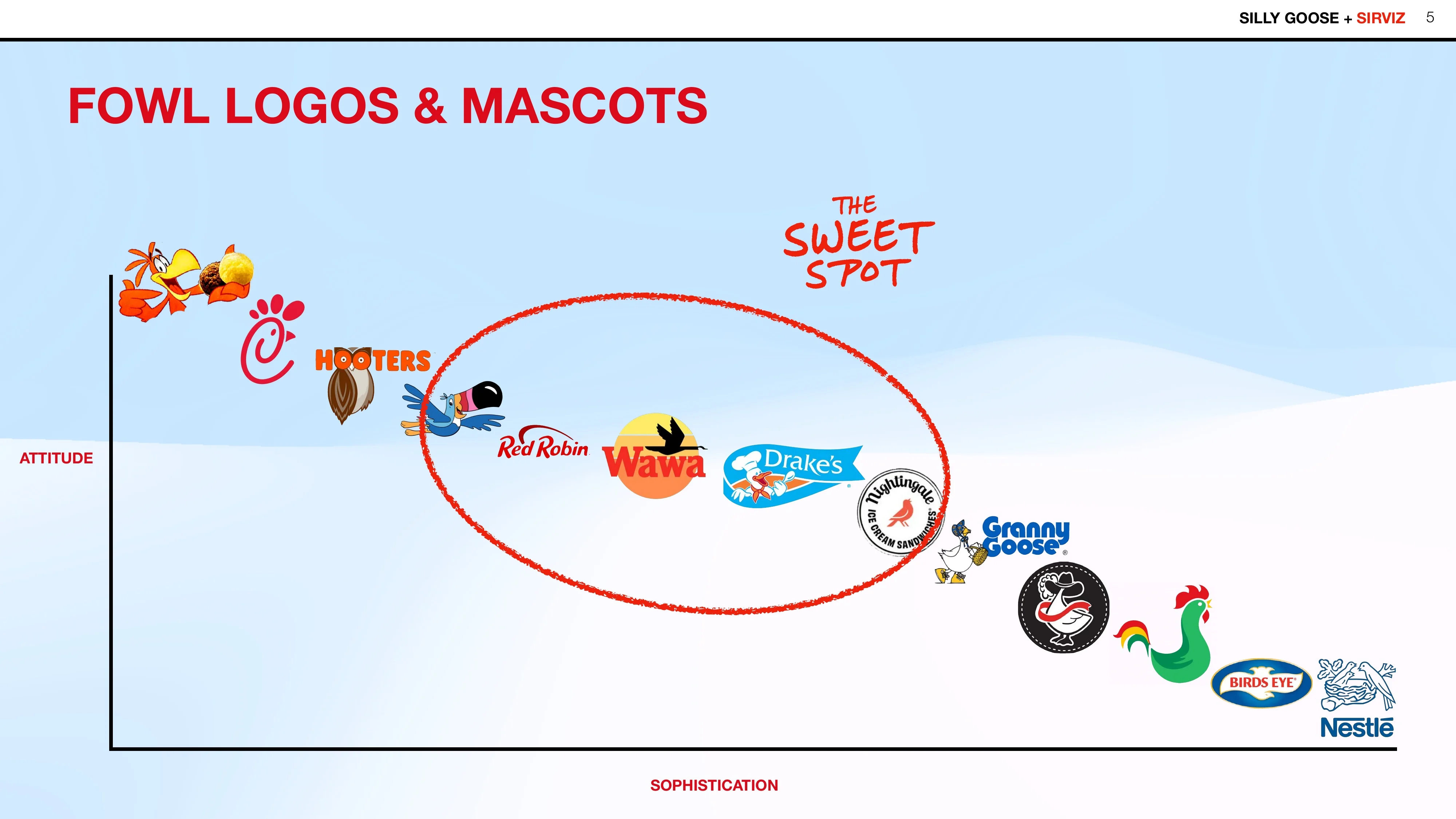
The Big Eater paired an enthusiastic goose with a sandwich so enormous that neither could be mistaken for supporting decoration. The relationship between character and product became the joke—and immediately communicated what the business sold.
The clients selected that concept as the foundation for the next phase.
From that point forward we needed to accessorize the goose!
Refining the Character
HAT. GLASSES. TONGUE.
ATTITUDE.
Once the basic character worked, refinement became a controlled exercise in personality.
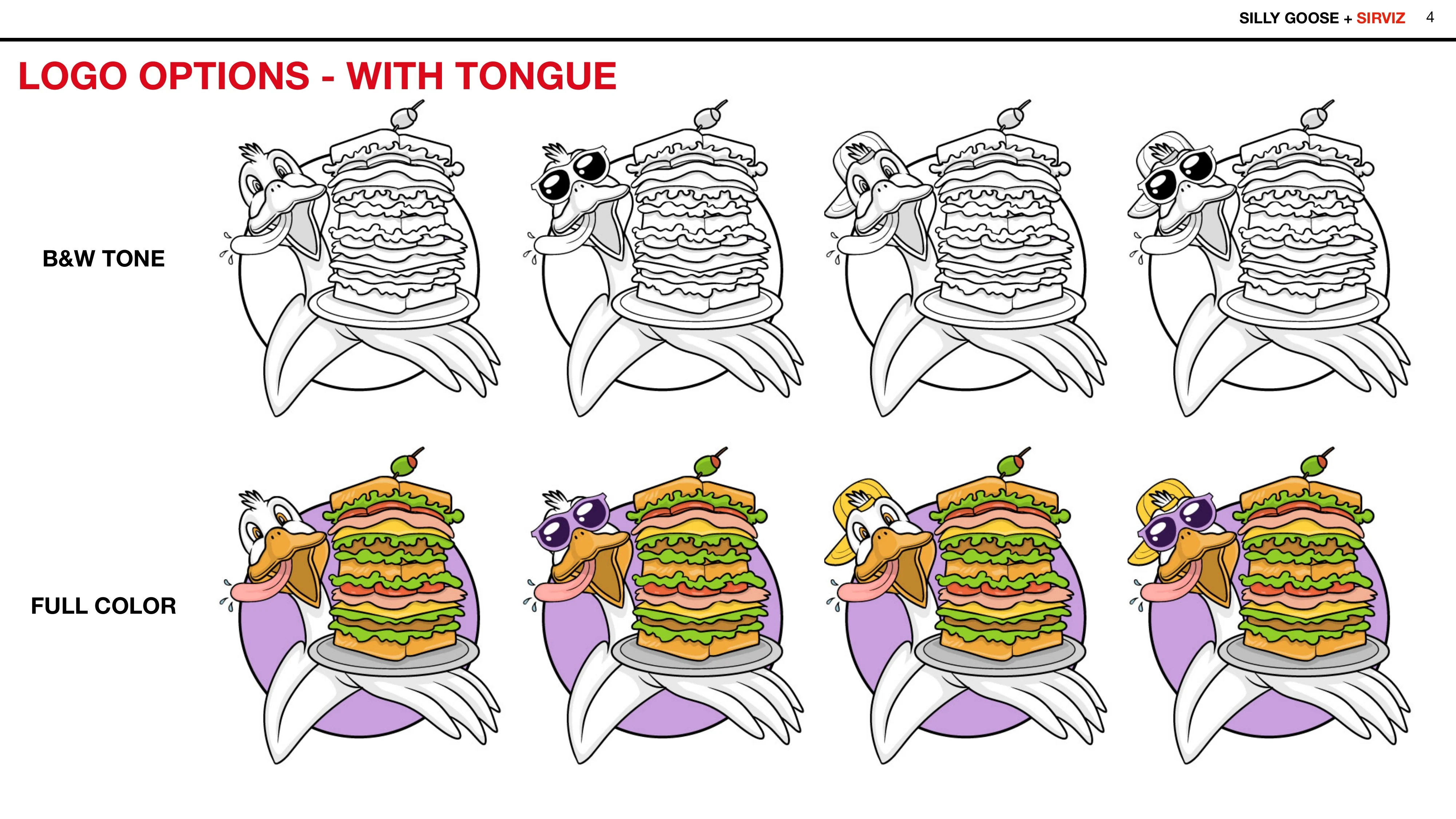
Black-and-white, spot-color, and full-color treatments tested how much visual information the mark could carry. Hats, glasses, and other accessories explored how easily the mascot could change character without losing its identity.
By the final review, the decisions had narrowed to small but meaningful variables: hat or no hat, sunglasses or no sunglasses, tongue out or tongue in.
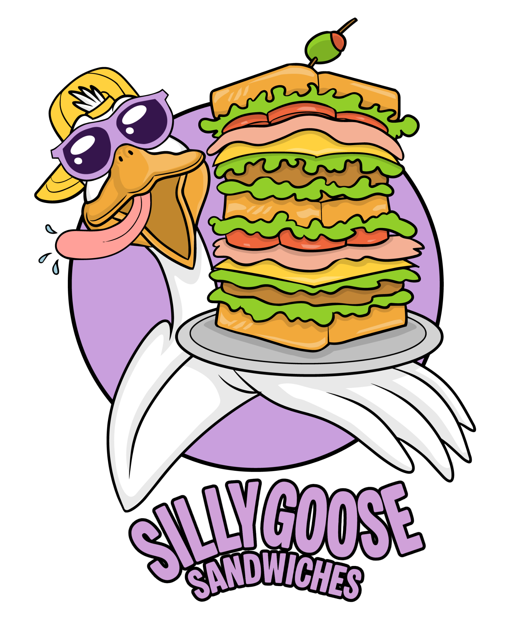
The final combination pushed the personality exactly far enough: backward cap, oversized purple sunglasses, tongue out, and a sandwich still doing half the visual work.
Typography
GIVE THE GOOSE
A VOICE.
The character could attract attention, but the business name still needed to function independently.
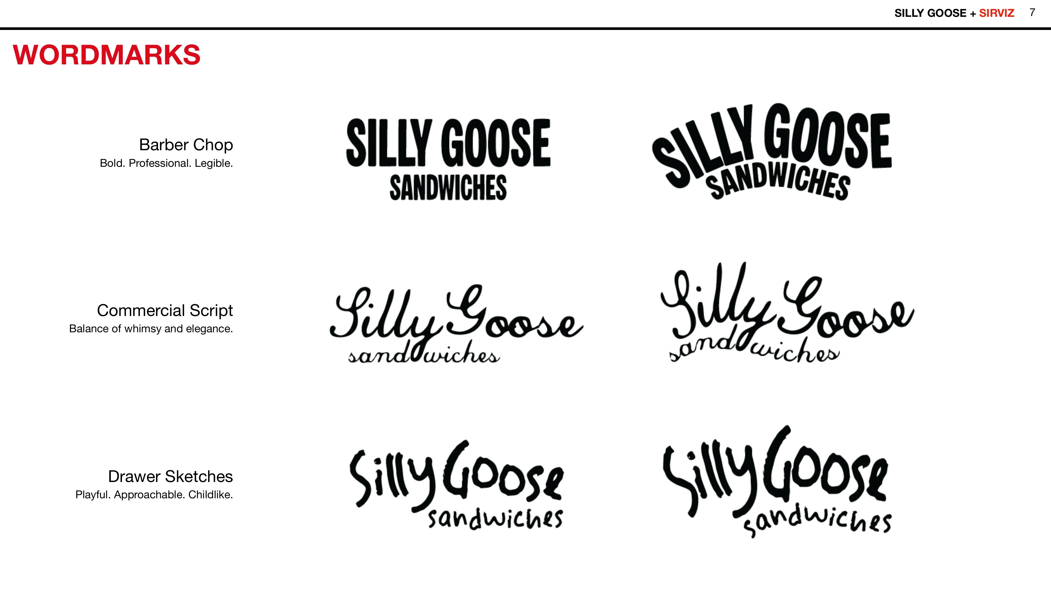
Early wordmark studies explored three different voices: a bold commercial style, a more elegant script, and a deliberately loose hand-drawn treatment. Each changed the personality of the same name.
The final direction returned to the bold, highly legible approach and curved it around the mascot, giving Silly Goose enough visual energy to belong beside the character without competing with it.
Designing a System
A MASCOT ON THE GO.
The logo was never considered only as an isolated mark.
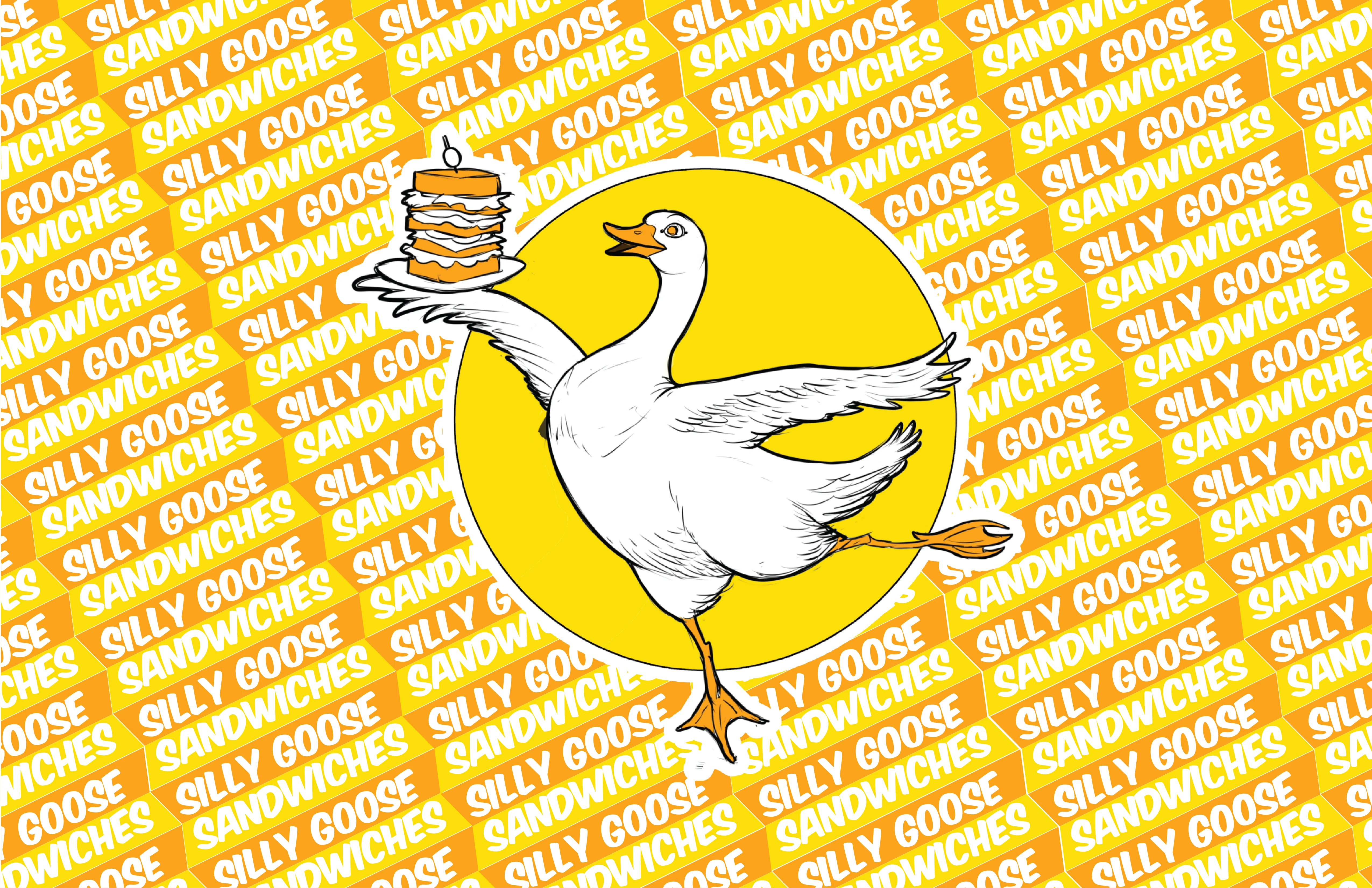
From the first presentation, the identity was tested against the places a food business would actually need it: sandwich wrap, shopping bags, stickers, merchandise, and—most importantly—the side of a truck.
Those studies were not finished production designs. They were application concepts used to test whether the character, typography, and color system could survive outside the logo.
Could the goose become huge? Could the wordmark work without it? Could the visual language create patterns? Could a customer recognize the truck from across a parking lot?
The answers helped shape the identity before final files were delivered.

The Result
READY TO FLY.
READY TO ROLL.
The final Silly Goose Sandwiches identity combines a highly recognizable mascot, a food-forward visual hook, an adaptable accessory system, a strong wordmark, and production-ready versions for print and screen.
The finished package gives the business a character that can do more than sit beside its name. The goose can become the face of the truck, packaging, merchandise, promotions, and future customer interactions.
The business has not yet launched its truck, so those real-world applications remain ahead.
But the identity is ready when they are.
A SILLY GOOSE
WITH A SERIOUS JOB.
Related character systems
Continue Exploring

See something worth building on?
Bring the strange problem, the half-formed world, the campaign, product, or story that needs a clear visual form.
Start a Conversation